
Taken from the iconic artist that is Picasso, Icasso was created to shake up the accessory space in style. Considered one of the top 3 sellers on Amazon for consumer electronic accessories, Icasso have had a long history in pushing the world of expressive and more personalised design trends forward. When they started, accessories where quite bland and standard, with the more unique designs costing too much to produce in scale. It was Icasso who made the calls and pushed the factories forward.
Somos was called in to help rebrand the already well known name, to reflect it's strengths and establish them as the leader of their space. It was important we keep strong links with the fashion world where they drew their inspiration from, while setting them up for new heights when they inevitably explore more accessory designs beyond just tech, but into the home and more.
We set out to create an identity for Icasso routed in its history and ready for its future goals. In doing so we created a brand we're proud to display on any item, the way the brand was intended.
It wasn't an easy task with a potential portfolio of hundreds of products and styles, trying to accommodate every users individuality and preferences while still forming a consistent visual language was the main challenge. This challenge led us to building the core identity around the chameleon, to represent the ever shifting and changing styles of all of users, allowing us to be fully consumer centric. The rest just fell into place.

We started by studying our audience. A community of users who set out to find their individuality in a world filled with collectivism. We found the need for personalisation was not only high but in a constant state of growth. We also saw how important fashion played in our user's lives, not just for aesthetic purposes but as a tool for finding their voice and being heard.

The research led us to this point. We needed a brand that could shift its style to match its intended user while giving them enough colour and variety to feel heard. In comes the chameleon. We begun a journey from this point, to find a way to present our brand in its best possible light.

We started from the figure of the chameleon, the perfect representation of personalization, therefore we had to use it as a symbol for the iCasso logo. We initially took a more illustrative approach and after some reviews, with the client, we decided to go for a simpler and more stylized version of the chameleon. iCasso has a wide choice of products and many different designs, so we wanted to represent this great diversity through the use of multiple colors. By doing so we have obtained a logo that is versatile and adaptable for any type of content. Always considering the product line of this brand, we developed patterns, which can be implemented practically anywhere, inspired by the natural environments of the chameleon.

Working with many different colors applications helped us to better understand what could and could not work. We have decided to never use more than one color in a single design, this was done to make everything more harmonious and less chaotic.
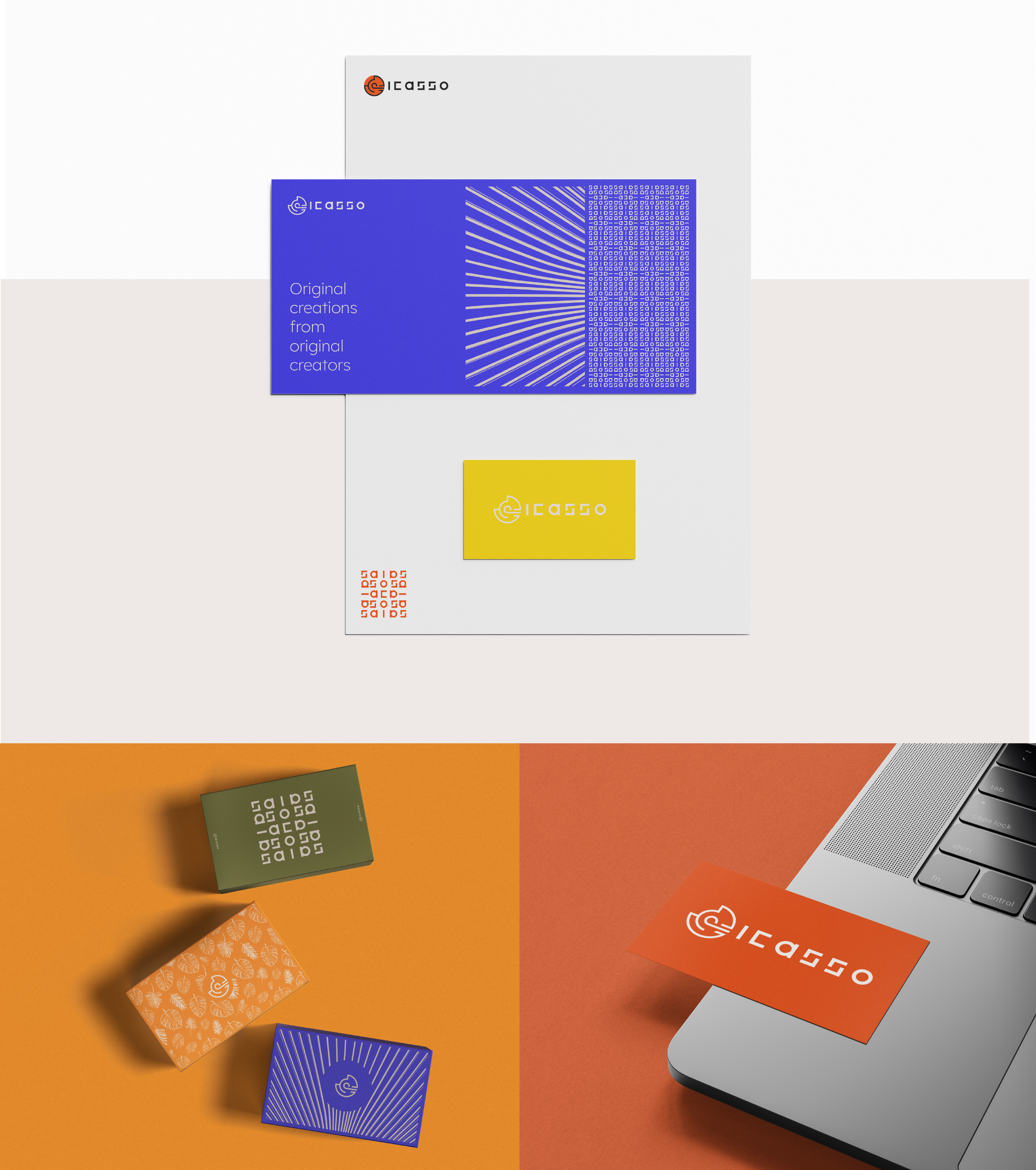
The last necessary steps were to apply the brand guidelines to the more practical aspects of the brand.

Creating a brand that represents individuality is hard. Creating a brand that is filled with creativity and passion is easy, so long as you have the right team behind it. The most important part of this entire project was always the users, and this brand was built with them in mind from the start.
